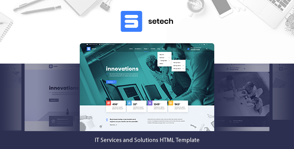
Setech is a clean, flexible and powerful HTML Template dedicated to all kinds of Web Agencies. It offers many various possibilities which will help you easily create a beautiful, stunning and unique website. We have developed this comprehensive HTML Template to deliver everything you’re looking for from a website. It’s tailored to your needs and to the expectations of your clients. It looks great on tablets and mobile devices due to its responsive design and retina graphics. It comes loaded with various page types, wide and boxed layouts, includes unlimited color schemes, great amount of fonts, icons and more. Highest quality of code, extended and easy-to-read documentation, prompt and qualified support are the key features Setech is s... READ MORE

Review Left On 05/16/2022
Beautiful template..
Rich and crispy in looks.
I love that it has Masonry included and the bonus in two different sizes
That is has a sticky menu bar with menu icon top left is also fantastic as menu template in mobile mode lacks that features. Your top menu bar is a tad too thick but it suites the clean minimalist feel that your template projects.
The Mega menu is also beautiful in Desktop mode, but n tad cumbersome in mobile mode. (I would have opted for sub-menus rather than the whole menu dropping down in the Blog Menu)
The three Home Page styles are beautiful, and my choice is Home 3 as the best of the three.
Another feature that i want to compliment you on is the fact that when menus come out/or/drop down when you click away/off them the menu closes. There is nothing more annoying than having to click on the same icon to close a menu as the one you used to open it.
The footer is beautiful and the spacing between items are just perfect for the white on purple color scheme you chose.
That said. I find only one flaw. And this is common with drop-down menus like this.
The thing i have an issue with is when the template is in mobile mode you have to physically click on the drop down arrow of that menu to open the sub-menu. The problem is this, visitors viewing your website would not always assume to click that arrow indicating sub-menu items. That they cannot just click anywhere to open that menu is confusing. and as such when you click on the name of that sub-menu title the menu does not pop open.
Other that that the menu is beautiful, clean, minimalist and fast.
Good luck and i hope you have many, many sales.
Medixer – Medical WordPress Theme
::
Astred - Modern Multi-Purpose WordPress Theme
::
Meto | SEO & Marketing WordPress Theme
::
PRISMA - Mobile UI Kit for Figma
::
Dento - Dental Care WordPress Theme
 Flatsome / WP Theme Reviews
